

Themes
Themes control the visual styling of the Fluid cashier so it matches the brand’s identity. Each operator links a Theme from their Operator Config, allowing different brands to keep distinct visual identities on the same platform. The font itself is inherited from your website.
Options
Section titled “Options”| Field | API key | Description |
|---|---|---|
| Button Style | button_style |
Shape of the buttons: Pill, Rounded or Square. |
| Gradient direction | button_gradient_direction |
Direction of the button gradient: Vertical (default, top to bottom) or Horizontal (left to right). Only applies when a button stop colour is set (see Colours). |
| Input Field Radius | input_field_radius |
Shape of the input fields: Pill, Rounded (default) or Square. |
| Inline Quick Deposit Border Radius | inline_quick_deposit_border_radius |
Border radius of the inline Quick Deposit element, in pixels. Defaults to 12px. |
Button and input field shapes
Section titled “Button and input field shapes” Button Style: Pill
 Button Style: Rounded
 Button Style: Square
 Input Field Radius: Pill
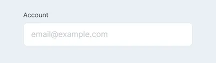 Input Field Radius: Rounded
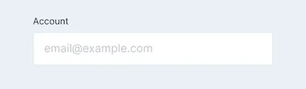 Input Field Radius: Square
Colours
Section titled “Colours”Colours can be set for up to 12 groups of wallet components:
| Group | API keys | Used for |
|---|---|---|
| Backgrounds | color_background_base, color_background_zero |
Wallet backgrounds |
| Text | color_text_primary, color_text_secondary, color_text_amount, color_text_disabled |
Text |
| Primary | color_primary |
Links, info text, radio inputs, active input fields, the selected border on the payment selector |
| Button | color_button_base, color_button_base_stop, color_button_hover, color_button_hover_stop, color_button_text, color_button_ghost_text |
Buttons. Setting a stop colour renders the primary button as a gradient from the base (or hover) colour to the stop colour. |
| Pill | color_pill_base, color_pill_base_active, color_pill_text, color_pill_text_active |
Amount selector |
| Status | color_success, color_error, color_alert, color_info |
Status messages |
| Overlay | color_overlay |
Popups, modals, and the background behind the wallet on desktop |
| Input | color_input_base, color_input_border, color_input_icon |
Input fields |
| Progress Bar | color_progress_bar_base, color_progress_bar_start, color_progress_bar_end |
Progress bar |
| Icon | color_icon |
Icons |
| Borders/Dividers | color_border, color_divider |
Borders and dividers |
| Card Input | color_card_gradiant_start, color_card_gradiant_end |
Card input gradient |
Step icons
Section titled “Step icons”Icons shown in the chat box for each step: Amount (step_amount), Bonus (step_bonus), Payment Method (step_payment_method), Secure (step_secure) and Checking Details (step_checking_details). An active campaign can replace them with its own icons.
Bonus image
Section titled “Bonus image”Bonus image placeholder (bonus_image_placeholder): the default image for any bonus that has no image of its own, or whose image can’t be loaded.
Success sound (success_sound): played when a transaction succeeds.
Font weight
Section titled “Font weight”The font weights have default values that can be changed to match the brand’s own:
| Field | API key | Default |
|---|---|---|
| Medium | font_weight_medium |
400 |
| Semi-bold | font_weight_semi_bold |
600 |
| Bold | font_weight_bold |
700 |
Sweepstakes currency icons
Section titled “Sweepstakes currency icons”For Fluid Sweepstakes, deposit_currency_icon and withdrawal_currency_icon are the default icons for the primary currency (the one to play with) and the secondary, redeemable currency. They are used only when the currency passed in virtual-currencies has no icon of its own.